
Sep 17, 2025
Lyft Case Study
1. Overview:
One of the top ride-sharing services, Lyft, redesigned its app to enhance usability, transparency, and the user experience in general. This is demonstrated in the Lyft redesign case study. At first, the app had problems like confusing color usage, poor driver representation, ambiguous options for new users, and awkward navigation. The design team at Lyft, under the direction of Frank Yoo, tackled these problems by using design concepts derived from Maslow's hierarchy of needs. Their primary objectives were to enhance discoverability and ergonomics, provide better context, and scale for future growth. A/B testing, user research, and ongoing input from drivers and passengers all aided in the redesign process.
2. Reasons for the redesign:
Inaccurate representation of Drivers:
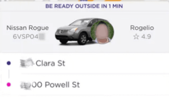
The previous version of the application didn’t provide adequate driver information, which was causing confusion among users to find their rides. They were unable to distinguish between assigned drivers and other vehicles.
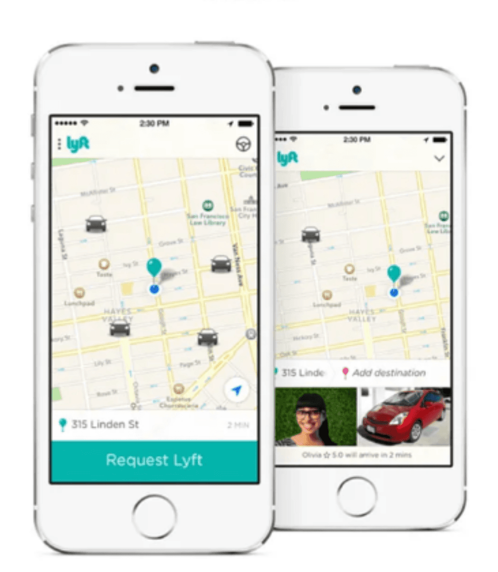
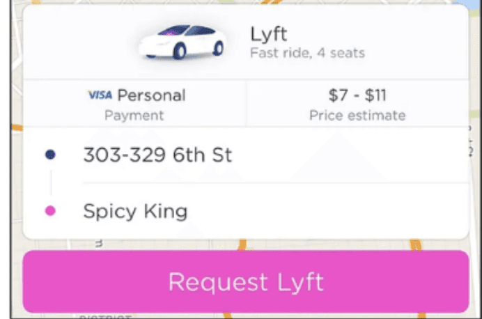
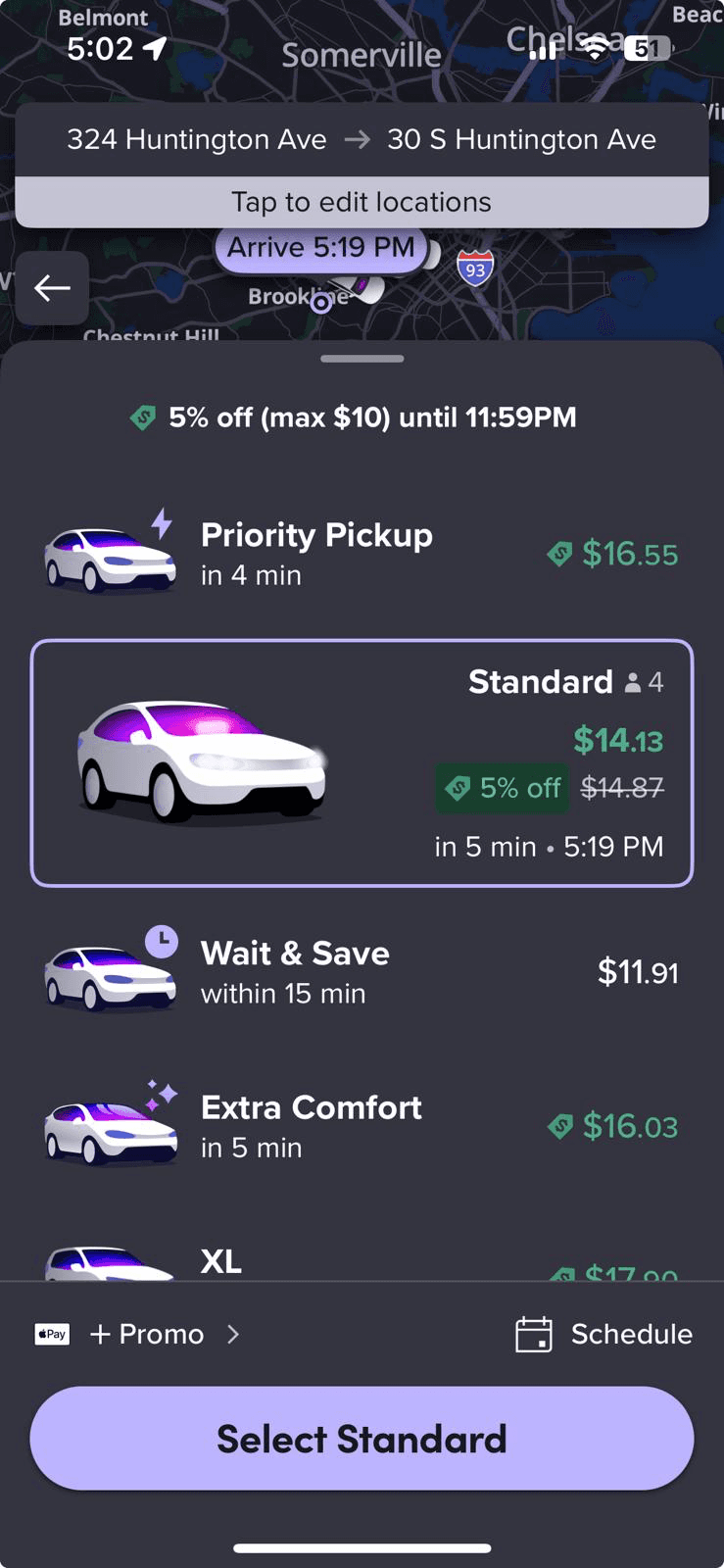
No price transparency and ETA information:
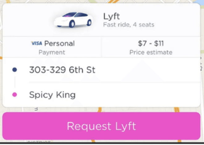
Earlier, users were not able to check the estimated price of the ride and to book rides users were not able to see the estimated time of arrival of their ride. Lack of such information was difficult for the users to make decisions about their transportation choices and budget.
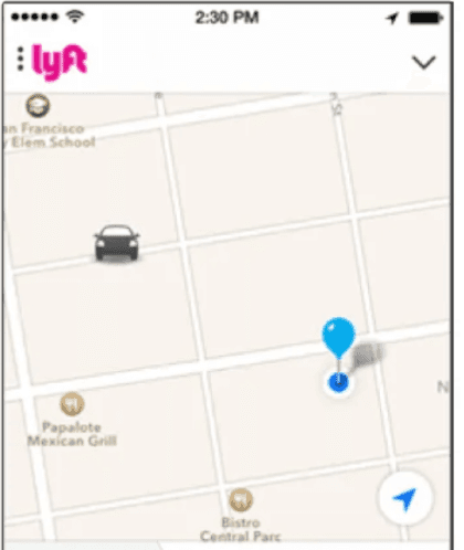
No vehicle direction provided:
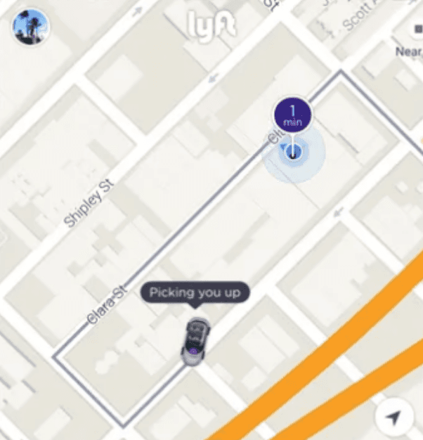
The previous version didn’t have any direction added to the ride, It was just a plain representation of a car. So it was very difficult for the users to check if the ride was heading towards them or not. This was one of the reasons to frustrate users particularly those with poor directional skills.
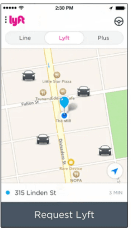
More use of lyft’s primary color in every aspect:
The previous version of the application had overused lyft’s primary color i.e pink and secondary color purple. This failed to impose a clear hierarchy of information and actions.
Poor Interface layout and ergonomics:
In the earlier version, the action buttons were spread out to the top and bottom of the screen which were forcing users to move their fingers across the screen more often.
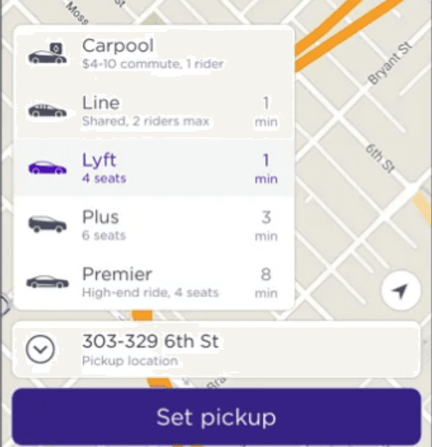
Inability to Scale further:
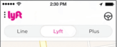
Scaling of the application was another issue as in the layout they have provided options of types of rides, if the types of rides are to be increased it will be cluttering the top part of the screen.
3. Solutions of issues faced:
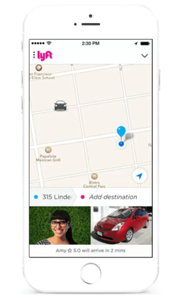
Accurate representation of drivers:
The redesign of the application provided users with more details such as driver’s number plate details, an option to call the driver, vehicle color and model of the ride. This helped the user find their ride with ease.
Price transparency along with ETA information:
The newer version of the application provided users much more information regarding the estimated cost of the ride which helped the user to make budget decisions accordingly. This version also lets users know how long it will take to reach the driver to the location, this helps users to plan their schedule accordingly.
Improved pictorial representation of the ride:
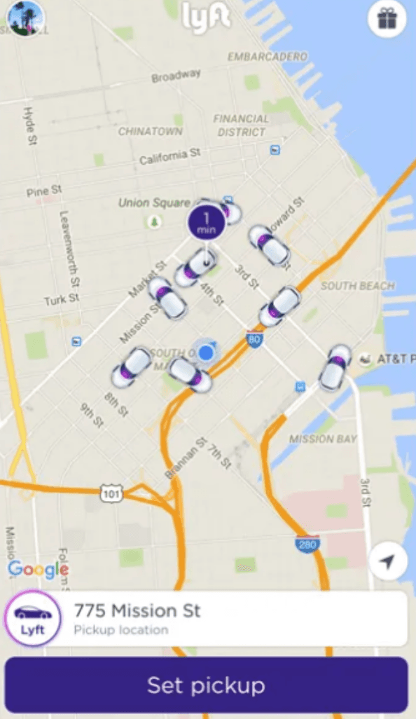
The improved version provided the users with a better pictorial version of the ride and it provided the direction as well to let the user know if the ride is heading to their direction or not.
Limited use of primary color:
The redesigned version of the application had less use of Lyft’s primary color to impose a clear hierarchy. Only important features were colored with pink such as the “Request Lyft” button and free rides button. Also the pictorial representation of rides were colored with a subtle hint of pink and purple.
More Structured interface layout:
The improved version of the application had given all the action buttons at the bottom of the screen. This helped users to not go back and forth using the top part of the screen too. Another major change was to provide the “call the driver” button in the action buttons below. Earlier it was hard to find the option to call the driver.
Provided options to Scale further:
The improved version of the application provided room to scale the application further. For instance they removed the top part of the interface where they have given the options to choose the types of rides. They now have provided a small menu option in the bottom to choose the types of rides. It can be scaled further by adding more types of rides without cluttering the user interface.
4. Current issues in Lyft’s application:
Too much information on the home screen:
The current version of the application has too much information cluttered together. The information that is cluttered are too many ride options. This clutters the information flow. For instance they have too many ride options at one place like lyft,XL, shared, etc.
Impact on Users:
This increases the decision time taken by the user, this often results in the user getting frustrated. They may switch to other cab booking apps. The new users who are trying this application for the first time might get overwhelmed by this.
Awkward Placement of Options Panel:
After booking a ride, the important options like Contact Driver, Split Fare, Send ETA, and Cancel Ride are tucked away at the bottom of the screen in small icons. Since they aren’t highlighted or visually distinct, they’re easy to miss.
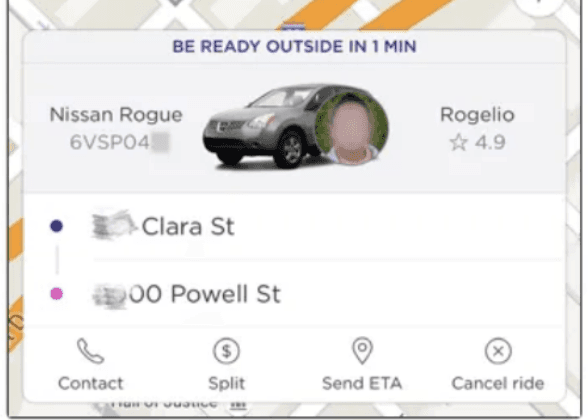
Impact on Users:
If you need to call your driver or cancel right away, you end up wasting precious time hunting for the button. This can be stressful, especially when you’re in a rush or standing in a busy location.With the icons crammed together and looking similar, it’s possible to hit the wrong one by accident like canceling a ride instead of contacting your driver.
5. Proposed solution for the current issues:
Context based ride recommendation:
Instead of displaying all ride types at once, the app can highlight the most relevant option based on user context (for example: If i am travelling alone then by providing the option to put the number of passengers the app can give only those options suitable to me).
Justification:
This will reduce the clutter and new users won’t be overwhelmed by too many options. It will also reduce the decision time that the user will take to book the ride.
Give the user 2-3 options based on the number of passengers and we can provide an option with more option buttons and provide other types of rides in that.Highlighting Key Action button:
We can move the more important options like cancel the ride and contact the driver to a better location along with the trip details card and use primary color to highlight that option and options such as split share and sending ETA can be grouped together below.
Justification:
This keeps the interface clean while ensuring the most important action is always front and center. It also prevents misclicks by separating critical options from less frequent ones.
6. Key Takeaways:
Putting users first pays off – Lyft proved that when you focus on making the app simple, clear, and transparent, people trust it more and are happier to keep using it.
Clear principles keep everyone on track – By sticking to core design values like clarity, consistency, and delight, the team avoided confusion and stayed aligned on what really mattered.
Testing and feedback make the difference – Through A/B testing and real user research, Lyft discovered what users actually wanted versus what designers assumed. This helped them fix real problems instead of imagined ones.

