
Sep 24, 2025
Reimagining Nike’s Checkout Experience: A UX Case Study on Reducing Cart Abandonment
Introduction
Over 70% of e-commerce transactions are impacted by shopping cart abandonment, which results in billions of dollars in lost revenue every year. In my analysis of Nike’s current checkout process as a UX designer, I found a number of issues that lead to this concerning figure. In order to increase user confidence, lower friction, and eventually increase conversions, this case study analyzes Nike’s current checkout process and suggests strategic redesign solutions.
Press enter or click to view image in full size
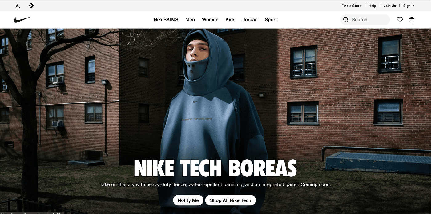
Nike
Understanding Shopping Cart Challenges in E-Commerce
Understanding the larger picture of e-commerce abandonment is essential before delving into Nike’s particular problems. Virtually every online retailer is impacted by the shopping cart abandonment phenomenon, which is more than just a technical issue; it is a complicated nexus of user psychology, business strategy, and design execution.
Unexpected Costs: The Sticker Shock Phenomenon
Research consistently demonstrates that additional expenses such as shipping, taxes, and fees that show up late in the checkout process cause 48% of online shoppers to abandon their carts. Once triggered, this “sticker shock” creates a psychological barrier that is challenging to overcome. Customers’ perceptions of the value proposition are drastically altered when they mentally commit to a $100 purchase and then find out at checkout that there are $15 in taxes and $10 in shipping. The cost revelation’s timing is crucial. Even when these expenses are normal business procedures, customers feel duped when they find out about extra fees at the register. Feeling “tricked” is an emotional reaction that can permanently erode brand trust and discourage customers from making additional purchases from the retailer.
Complicated Checkout: The Multi-Step Maze
Users must typically navigate between five to seven different form fields and decision points during the checkout process, but research indicates that abandonment rates rise sharply when the number of steps is increased beyond three. The cognitive load is more complicated than the number of steps. Decision fatigue occurs when users are presented with lengthy forms that require account creation, unclear shipping options, or perplexing payment flows. The simplest course of action, closing the browser tab, is frequently the result of this mental fatigue. The most effective checkouts generate momentum, which makes each step seem inevitable and quick rather than laborious and optional.
Poor Mobile and Cart Usability: The Small Screen Struggle
Since more than 68% of all e-commerce sessions take place on mobile devices, problems with mobile usability have emerged as the main cause of cart abandonment. The inherent difficulties of completing complex transactions on small screens are reflected in the mobile abandonment rate of 85.65% compared to the desktop’s 73.07%.
Tiny tap targets make it challenging to change cart quantities, remove items, or switch between product options, which presents special challenges for mobile users. It can be annoying and prone to errors to type shipping and payment details on mobile keyboards. Furthermore, mobile users are more likely to shop in distracting settings while commuting, multitasking, or in social settings, which increases the likelihood that they will abandon unfinished purchases.
Security Concerns: The Trust Deficit
Despite decades of e-commerce growth, security concerns still drive 17% of cart abandonments. This isn’t necessarily about actual security risks most major e-commerce sites have robust security measures but rather about perceived security and trust signals.Users look for visual cues that indicate their information is safe: SSL certificates, trust badges, secure payment icons, and recognizable payment processors.
Browsing Without Buying: The Wishlist Mentality
A significant portion of cart abandonment estimated at 30–40% of all cases occurs because users never intended to purchase immediately. Instead, they use shopping carts as temporary storage or wishlists, a behavior that’s become increasingly common as e-commerce sites have made adding items to cart frictionless.This “research shopping” behavior is particularly prevalent in higher-consideration categories like fashion, home goods, and electronics. Customers add items to compare prices across sites, show products to friends or family members, or save items for future purchase consideration.
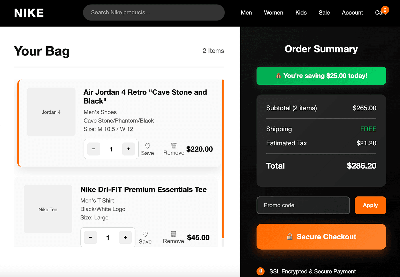
The Current State: Nike’s Checkout Challenges
After analyzing Nike’s desktop and mobile checkout experiences, I identified several key usability issues:
Desktop Checkout Problems:
Overwhelming Form Fields: The desktop checkout presents numerous form fields simultaneously, creating cognitive overload
Lack of Visual Hierarchy: Information is spread across the page without clear prioritization
Hidden Costs: Shipping and tax information appears late in the process
Press enter or click to view image in full size
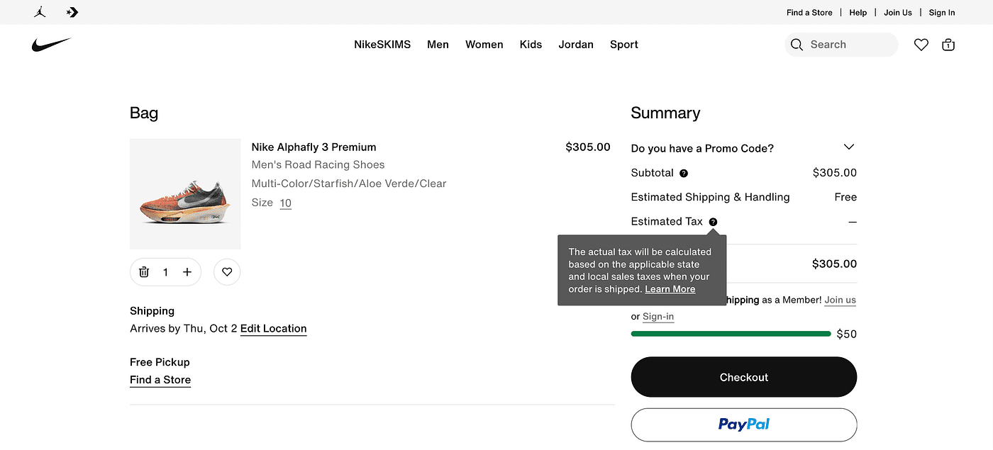
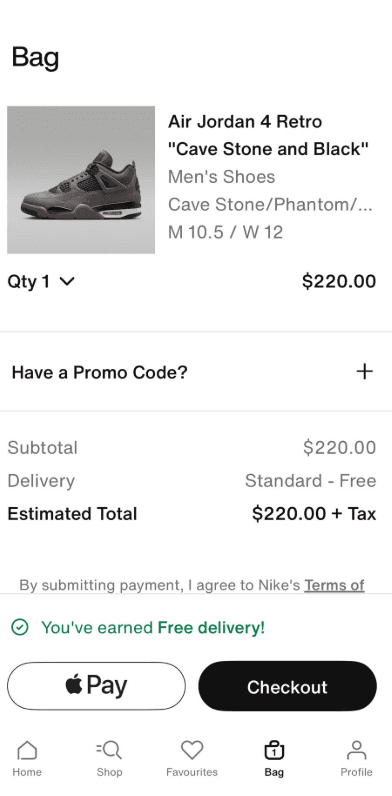
Nike Website Cart
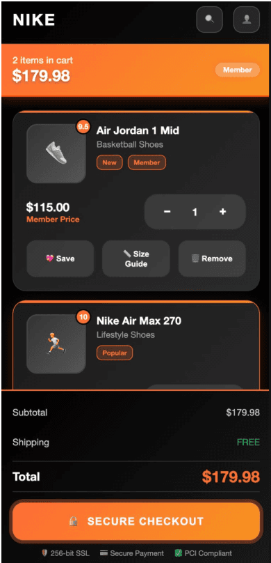
Mobile Checkout Issues:
Compressed Interface: Critical information is cramped on smaller screens
Limited Payment Options: While Apple Pay is available, other accelerated payment methods could be better integrated
Promo Code Placement: The “Have a Promo Code?” section is tucked away, potentially missing revenue opportunities
Proposed Strategy for Enhancing Nike’s Shopping Cart Experience
Strategy 1: Implement Transparent Progressive Pricing
The Problem: Nike currently hides shipping costs and taxes until late in the checkout process, contributing to the large number of users who abandon due to unexpected costs.
The Solution:
Real-time shipping calculator on product pages and cart view
Tax estimation based on user’s detected or entered location
Upfront total pricing display: “Your total will be approximately $XXX including estimated tax and shipping”
Free shipping threshold indicators with progress bars showing how much more to spend for free shipping
Transparent pricing breakdown in cart summary that remains visible throughout checkout
Expected Impact: Research shows transparent pricing can reduce price-related abandonment, potentially recovering significant revenue from Nike’s high-value athletic footwear and apparel sales.
Strategy 2: Streamlined Single-Page Checkout with Progressive Disclosure
The Problem: Nike’s current multi-page checkout creates multiple abandonment opportunities and increases cognitive load.
The Solution:
Single-page accordion-style checkout that expands sections as users complete them
Clear progress indicators showing completion percentage and remaining steps
Auto-save functionality that preserves user input even if they navigate away
Smart form sequencing that collects most critical information first (shipping address for tax calculation)
Guest checkout prominence with member benefits clearly communicated but not forced
Strategy 3: Mobile-First Cart and Checkout Optimization
The Problem: Nike’s mobile experience suffers from the industry-standard abandonment due to poor mobile usability.
The Solution:
Thumb-friendly interface design with minimum 44px touch targets
Sticky cart summary that follows users through the mobile checkout process
One-tap quantity adjustments with large +/- buttons and swipe-to-remove functionality
Enhanced mobile payment integration featuring Apple Pay, Google Pay, and Shop Pay prominently
Voice-to-text capability for address entry on supported devices
Smart keyboard optimization (numeric for phone/zip, email-specific for email fields)
Strategy 4: Personalization and Nike+ Integration
The Problem: Nike isn’t fully leveraging its membership program and user data to create personalized checkout experiences.
The Solution:
Member-exclusive checkout lanes with pre-filled information and faster processing
Personalized payment method suggestions based on purchase history
Size recommendation integration based on previous Nike purchases
Exclusive access messaging for limited releases and member-only products
Reward points integration showing points earned and redemption opportunities
Purchase history quick-reorder functionality
Strategy 5: Smart Cart Persistence and Recovery
The Problem: Users treat carts as wishlists, leading to inflated abandonment statistics and missed conversion opportunities.
The Solution:
Intelligent cart persistence across devices and sessions for Nike+ members
Cart expiration notifications with clear timelines for limited-edition items
Stock level indicators creating urgency for popular sizes and colors
Personalized recommendations based on cart contents and browsing history
Multi-device cart synchronization allowing users to start on mobile and finish on desktop
Smart remarketing triggers based on user behavior patterns
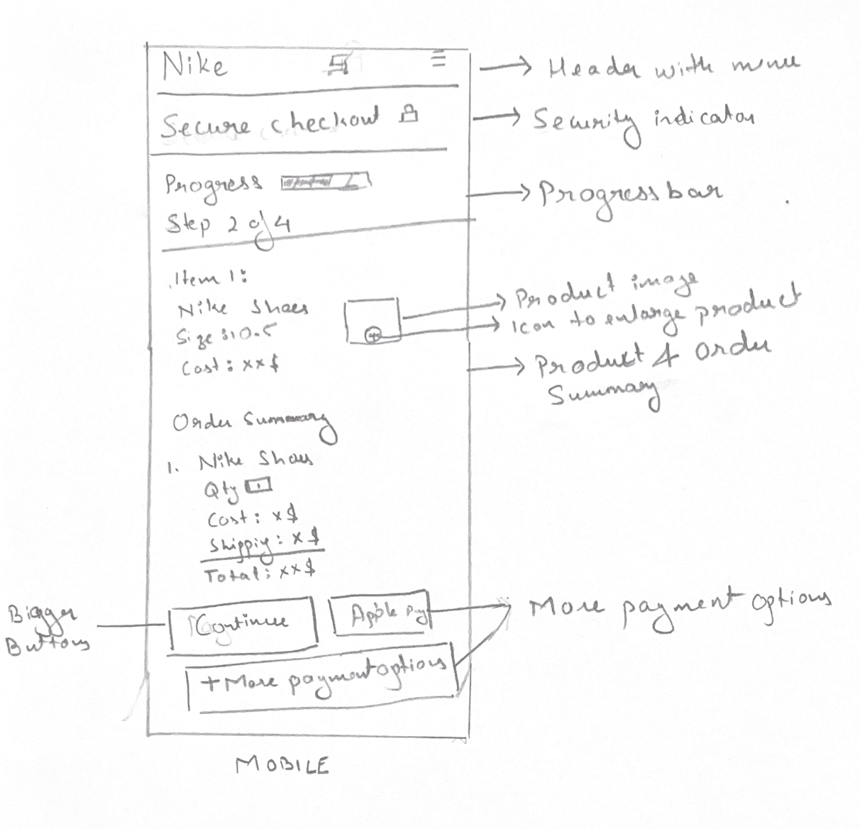
Hand-Drawn Sketch: The Human-Centered Approach
Press enter or click to view image in full size
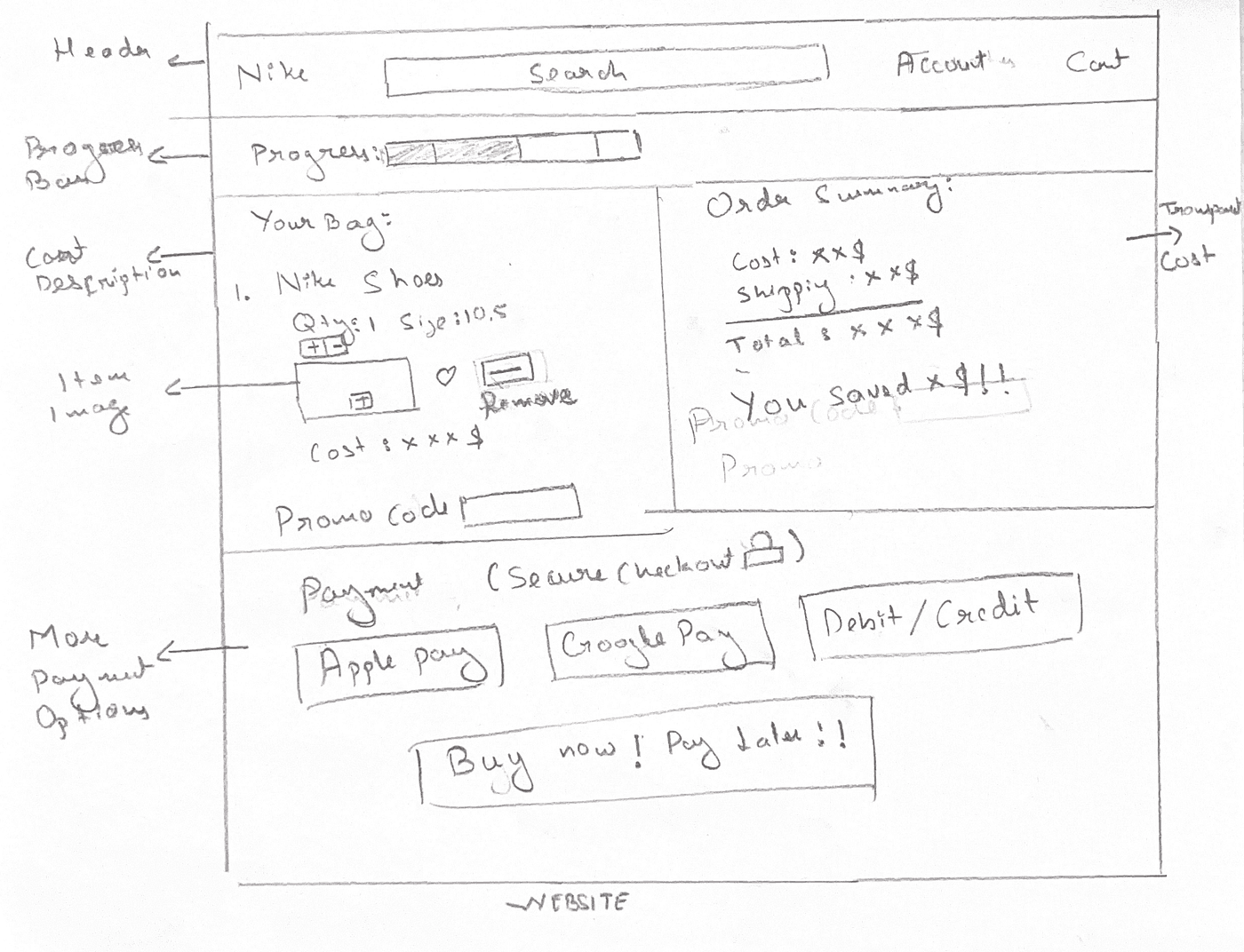
Nike Website
Improvements for the Website in Hand-Drawn Sketch
Two-Column Layout: Efficient use of desktop space with cart details left, summary right
Transparent Pricing: “You Saved $9!!” message and clear cost breakdown builds value perception
Progress Indication: Visual progress bar shows completion status effectively
Multiple Payment Methods: Apple Pay, Google Pay, and Debit/Credit options cater to user preferences
Prominent CTA: “Buy now! Pay later!!” creates urgency and offers flexibility
Product Management: Quantity selector and remove option give users control
Promo Code Integration: Dedicated promo code section captures additional revenue
Areas for Enhancement in Desktop Design:
Visual Hierarchy: The order summary could use better spacing and typography hierarchy
Shipping Options: Show multiple shipping speeds with costs for user choice
Press enter or click to view image in full size
Nike Mobile
Improvements for the Mobile App in Hand-Drawn Sketch
Clear Security Indicators: “Secure Checkout 🔒” prominently displayed builds immediate trust
Progress Visualization: Progress bar with “Step 2 of 4” gives users clear completion expectations
Simplified Order Summary: Clean breakdown of costs (shoes, shipping, total) reduces cognitive load
Multiple Payment Options: Apple Pay and “More payment options” address payment flexibility concerns
Product Information: Clear item details (Nike Shoes, Size 10.5, Cost) help users verify their purchase
Large CTA Buttons: “Continue” and “Apple Pay” buttons are appropriately sized for mobile interaction
Areas for Enhancement in Mobile Design:
Form Field Optimization: Consider adding form field labels inside inputs to save vertical space
Trust Signal Enhancement: Add security badges or payment processor logos near payment options
Real-time Validation: Indicate where address autocomplete or validation would occur
AI Generated Sketch For Desktop Site
Press enter or click to view image in full size
Improvements
Clean Two-Column Layout: Perfect separation between cart items (left) and order summary (right)
Prominent Secure Checkout Button: Large, orange CTA button with lock icon builds trust and draws attention
Security Messaging: “SSL Encrypted & Secure Payment” badge at bottom builds confidence
Savings Highlight: Green “You’re saving $25.00 today!” creates positive value perception
Quantity Controls: Intuitive +/- buttons for easy quantity adjustment
Save/Remove Options: Users can manage items without losing progress
Areas Still Requiring Improvement
Missing Guest Checkout Option: No clear indication if account creation is required
No Cross-Selling Opportunities: Missing “Frequently bought together” suggestions
Weak Value Proposition: Could emphasize member benefits, exclusive access
No Alternative Payment Methods: Missing Buy Now, Pay Later options
AI Generated Sketch For Mobile App
Press enter or click to view image in full size
Improvements
Large, full-width “SECURE CHECKOUT” button optimized for thumbs
Clear quantity controls with +/- buttons
Comprehensive action options (Save, Size Guide, Remove)
Triple security validation builds trust
Areas Still Requiring Improvement
No swipe gestures or pull-to-refresh functionality
Missing payment method preview (Apple Pay, Google Pay)
No size information display (critical for footwear)
Comparing Approaches: Hand-Drawn vs. AI-Generated
Hand-Drawn Strengths:
Pure User Focus: Unconstrained by technical limitations
Creative Problem-Solving: Novel solutions emerged naturally
Simplicity: Forced prioritization of only essential elements
Authenticity: Solutions felt more human and intuitive
AI-Generated Strengths:
Technical Feasibility: Designs incorporated realistic implementation constraints
Pattern Recognition: Leveraged proven UX patterns from successful sites
Consistency: Maintained visual coherence across different screen sizes
Sophistication: More polished visual design and interaction details
Which Communicates Intent Better?
The hand-drawn sketch better communicates the why behind design decisions — the user psychology and strategic thinking.
Applied UX Strategies from Research
1. Progressive Disclosure
Implementing step-by-step checkout flows that clearly label each stage to reduce cognitive overwhelm and provide clear progress indicators.
2. Mobile-First Design
Addressing the reality that mobile traffic makes up about half of all web traffic by designing for smaller screens first, then scaling up.
3. Trust Building Through Transparency
Following the principle that “showing every purchase-related cost upfront is a basic eCommerce UX best practice” to address the primary abandonment concern.
4. Psychological Friction Reduction
Implementing guest checkout options prominently, as 40% of buyers would finish their purchase if they don’t have to create an account.
5. Error Prevention and Recovery
Incorporating real-time validation and helpful error messaging to prevent the frustration that leads to abandonment.